Spider Chart, Spider Chart,
Visualizes whatever a spider can
Spins a chart, any size,
Catches insights just like flies
Look Out!
Here comes the Spider Chart
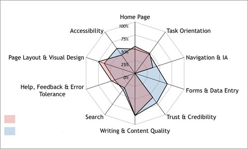
A spider chart plots the values of each category along a separate axis that starts in the center of the chart and ends on the outer ring. These charts are great ways of visualizing the strengths and weaknesses of your current or future state website user experience. At Bluetext we have a deep focus on the science of user experience. After all, when you design and build sites for Fortune 500 companies, every fraction of a percent counts.
Bluetext likes to help visualize the various states of our analysis in spider graphs.
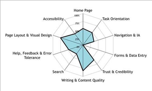
Competitive Analysis Visualization Through Spider Graphs
In today’s fast moving digital marketing world it’s critical to be a watchful eye for our clients to ensure they have a competitive advantage. A real time pulse and visualization of where they fall in the competitive marketplace can be very valuable. The below sample spidergraph can show a marketing leader where they stack in many categories. They can review these sequentially chronologically to see how they are progressing and ensure they have the best opportunity to capture and convert users across their desired journeys to achieve the key performance indicators the site is measured against.
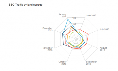
SEO and Landing Page Optimization Visualization Through Spider Graphs
If you really want to impress during a presentation, this is the chart for you. It allows you to display multivariate data easily while also impressing with the visual appeal of its radar shape. Check out the chart above which shows SEO traffic by landing page. This Spider Chart stylishly displays SEO traffic for each series of pages in a specific time frame. This kind chart allows you to easily see real SEO traffic rather than just keyword ranking reports like those from Google Analytics. At the end of the day, the quality and amount of traffic matters more than just keyword ranking. translations The Spider Chart can be used to hold the attention of your audience as you explain the insights you’ve discovered in a way which won’t scare them off.
These charts are just the tip of the data visualization iceberg. Talk to us at Bluetext about your story, brand, or data visualization needs.
Brand Strategy. Brand Presentation. Brand Delivery. Bluetext.