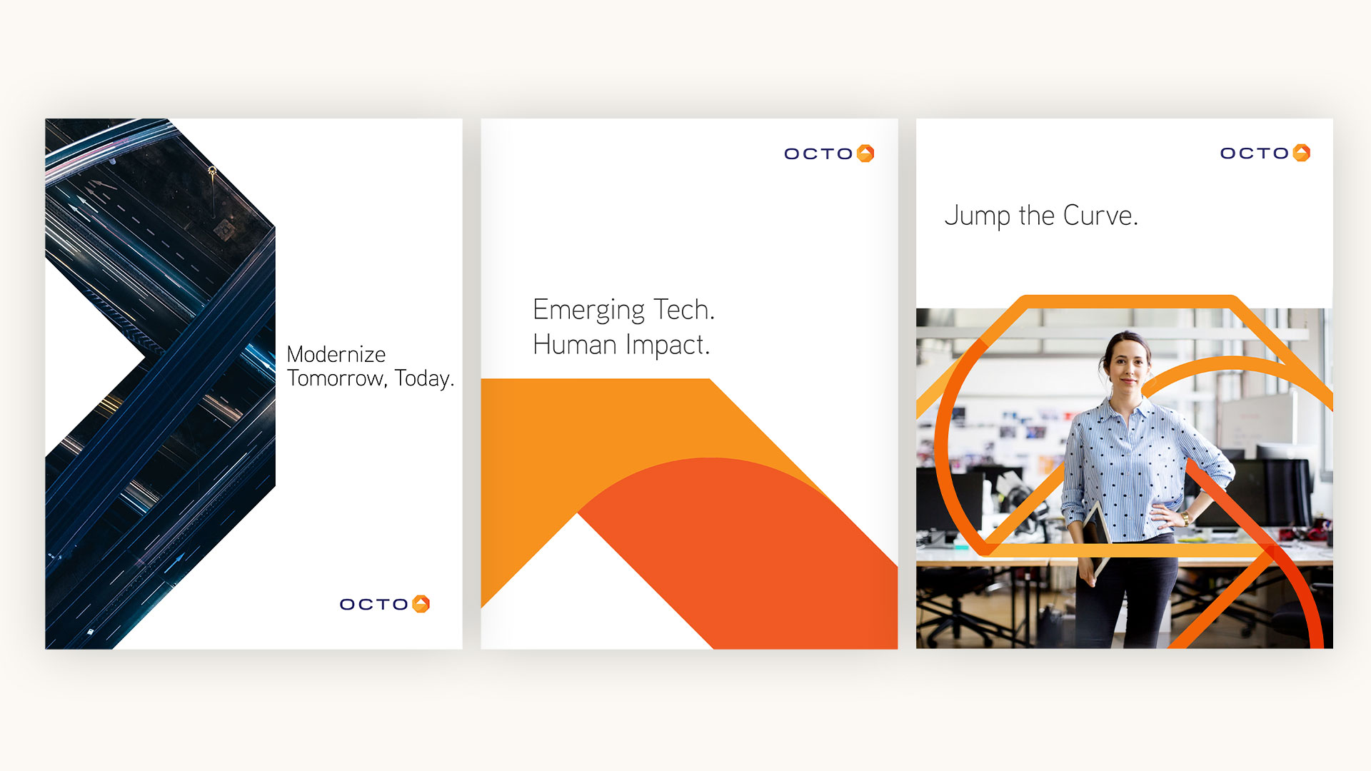

A Heroic Brand Evolution
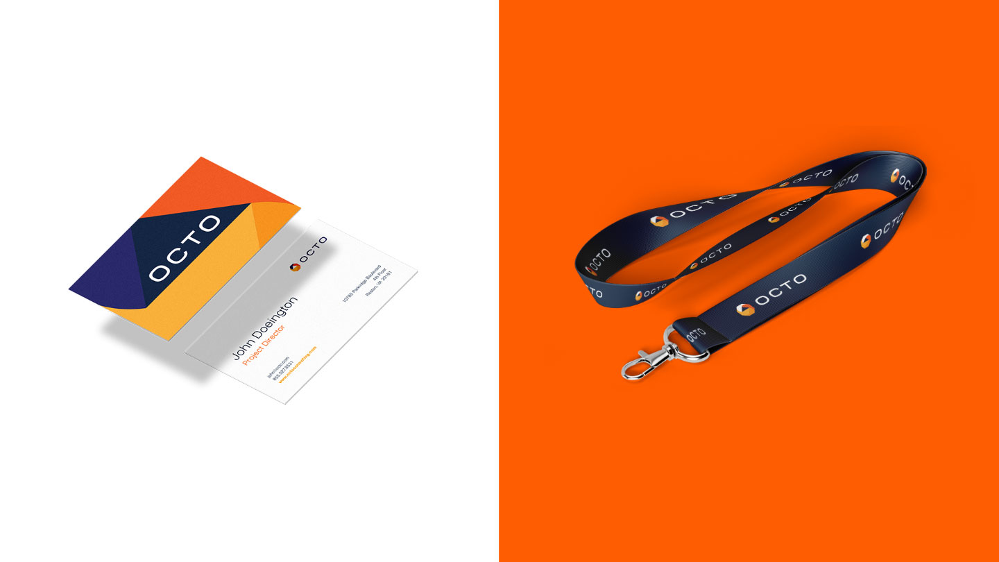
A modern visual identity was the steward for united company messaging, business goals, and recruitment objectives. With a refreshed logo leading the way, the remaining brand collateral followed suit.
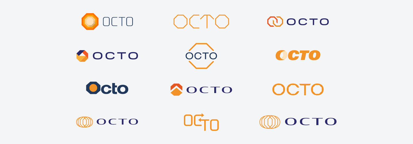
Secret to Successful Evolution
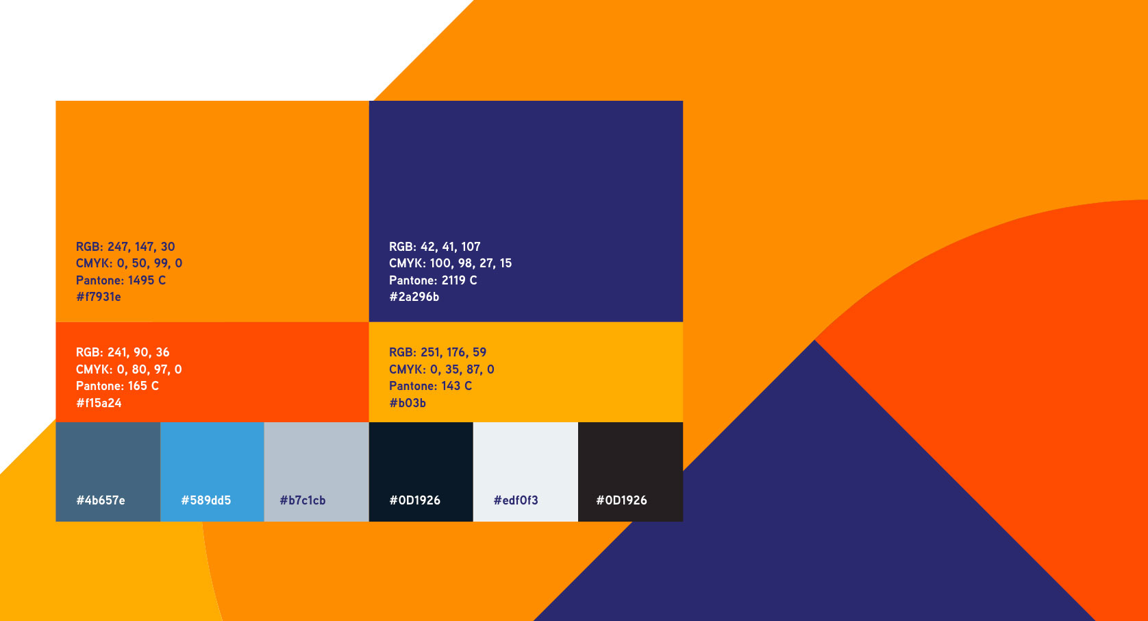
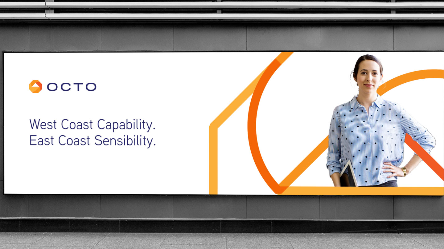
While logos are new, the brand elements needed to stay similar to the existing ones. Bluetext modernized Octo CVI without starting from scratch through additional colors, a new typeface, and upgrades to iconography and imagery treatment.
Telling the
"Octo-Knot" Story
Bluetext designed a visual identity that aligns Octo and Sevatec’s legacies under one united mission. The logo illustrates a juxtaposition of complexity and process. Nicknamed the “Octo-knot” the style shows depth, adaptability, and finesse. With the arrow in the center anchoring everything together, there is a sense of balance, while also keeping you on your toes. The interwoven angles that make up the octo-knot show an infinite looping system, conceptualizing the story of an ever-changing industry, with both an infinite demand to improve and an infinite opportunity to innovate.