The next time you’re in a public setting, look up, and chances are you’ll notice almost everyone around you has their eyes glued to a mobile device in hand. Modern-day mobile devices are essentially mini computers, enabling on-the-go browsing, communication, and connection at unprecedented ease. Society has become accustomed to instantaneous connection, but not all websites are up to par with user expectations. While desktop sites were once the focus, a disappointing mobile performance of websites is holding many companies back from their full online potential to garner customers. Aside from a frustrating user experience, poor mobile performance can hurt a website from a technical SEO perspective. This is why many companies are turning to digital agencies like Bluetext to revamp or create entirely new, responsive web designs & optimized performance to stand out among their competitors.
On average, mobile devices account for more website user traffic than desktops. However, despite the high traffic volume, conversion rates on mobile environments are significantly lower. So what’s turning our mobile users away? Adrienne Clem, Director of Search Ads Growth and Optimization at Google, describes that it could be an issue with any one of the following pillars of mobile website design:
Speed
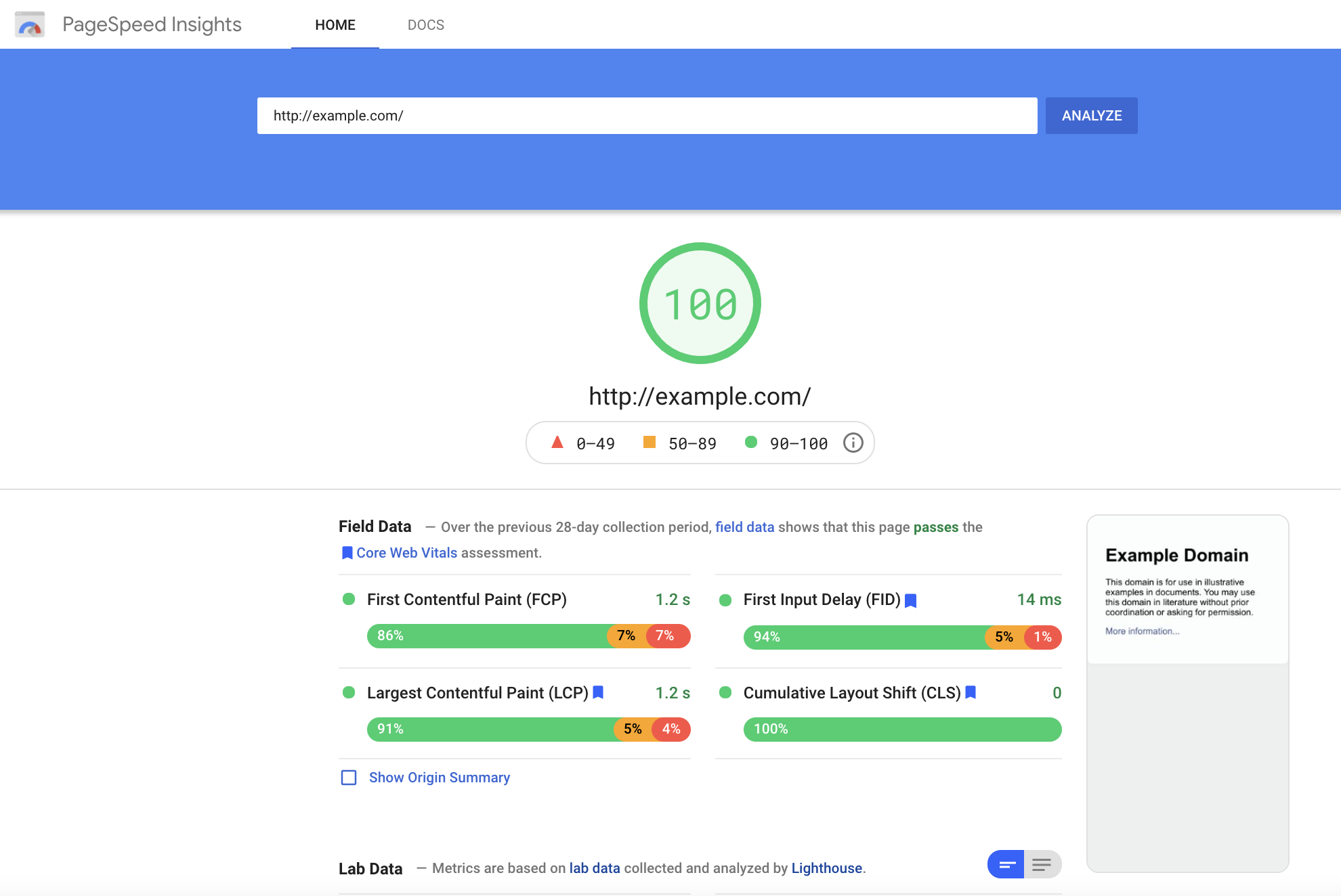
Page Speed is a key indicator of website quality, as it is a critical first impression of your website. The longer a user must wait for your website content to load, the higher the risk of the user leaving the page and increasing the bounce rate. Bounce rate, performance, and speed metrics all play a critical role in Google search crawlers’ evaluation of a website. (such as, In addition to limiting bounce rates, reducing your Time to First Byte can also increase your site’s SEO ranking. You can keep tabs on your site’s speed performance using tools like Google, PageSpeed Insights, or GTMetrix.com, but consulting a website development agency can offer further insight into actionable steps to improve your site’s performance.
User Experience
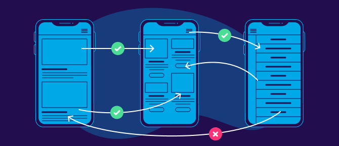
All websites should be designed to be as simple as possible for users to navigate. However, this isn’t as easy as it sounds. Content hierarchy, navigation, and calls to action are all critical components that need to be equally accessible and intuitive across desktop & mobile formats. Responsive layouts are essential in a mobile-optimized design, but more important is the speed at which content loads for a user. Mobile site speed tends to lag behind its desktop counterpart, but a poor mobile performance can significantly ding your site’s SERP ranking and create a poor user experience. Even the most creative & persuasive landing pages are wasted if features take too long to load on the screen. Pages that utilize AMP (Accelerated Mobile Performance) technology both rate higher on Google search rankings and increase chances of conversion for paid media promotions. AMP HTML is an open framework based on existing web technologies, that allows for more lightweight and speedier mobile web pages. In an initiative to enhance the shift to mobile browsing, AMP-powered webpages load instantaneously, even when they contain rich media like video, animations, or graphics, including things like Twitter and YouTube embeds.
Iterative Design
Website design is an iterative and ongoing process. Platforms & technology are constantly evolving to include new features, remedy existing pain points and approach the ever-moving target that is positive user experience. Companies should approach this process in the interest of continued learning and constant improvement. Collecting feedback should be built into the plan for any mobile site development, as the site’s performance should be re-evaluated at least every 3-6 months. Keeping track of your site’s vitals is an important step for ensuring that your site stays relevant and isn’t losing out on potential conversions.

In an increasingly mobile-first world, emphasizing the performance of sites on mobile devices can increase customer loyalty and satisfaction. Whether a prospective customer’s impression of your campaign landing page or an existing customer’s experience browsing your full website, speed is the name of the game. Keeping up-to-date with best practices in website development and enlisting the help of seasoned designers and UX specialists can transform users from mindless mobile scrolling to enthusiastic interactions on your site.
If you’re ready to start designing your site with a mobile audience in mind, Contact Bluetext for guidance and expertise.