When we talk about motion in branding, we’re talking about a wide variety of creative approaches. From subtle homepage loading flourishes to complex, eye-catching 3D advertisements, animation can breathe new life into your brand. Today Bluetext will explore why motion design for logos is on the rise, when it’s best applied, and some of our favorite examples.
The digital landscape is crowded, to say the least. The average American spends a little over seven hours a day on the internet, and much of that time is spent surrounded by thousands of brands and advertisements. A well-done animation can help your brand stand out from the crowd and add essential layers of personality to your marketing collateral.
Whether your brand is neat and polished or playful and young, animation can reinforce those core characteristics without a single word. Picture the old Nickelodeon “splat” logo, for example. In 2009, a handful of disparate channels (TeenNick, Nick at Nite, etc.) were rolled into the Nickelodeon brand, and a new logo was unveiled to go along with the consolidation. The older logo’s animation had a younger, scrappier feel, while the current logo is much more refined, and gets at the large-scale, premium approach of Nickelodeon’s parent company, Paramount. These approaches are vastly different from one another, but there’s not one “right” answer when it comes to logo motion. Both animation styles are integral parts of the brand’s history and tell the story of a brand’s evolution. I’ve said it before and I’ll say it again: If a picture is worth a thousand words, an animation is worth a million.

Virtually any digital platform is an option when it comes to displaying an animated logo, but as they say, moderation is key. Instead of applying motion “just because,” it’s important to have intention behind the choice to display a static or animated logo. Here are a few of our favorite intentional applications of motion design in logos.
Use an animated logo when your space and time are limited
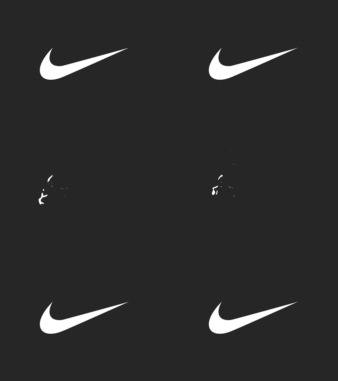
In cases where viewers may only see one or two components of an ad (scrolling quickly through a social feed, for example), you can convey more with an animated logo than you can with a static one. The key in these instances is to take up about the same amount of space and time as a static logo. This means your animation should be quick and to the point, like the example below from Nike. An added feature of Nike’s animation style is that they apply a different animation style depending on the audience and product, so each motion graphic feels uniquely suited to its context.

Amp up your site’s intro screen with logo motion
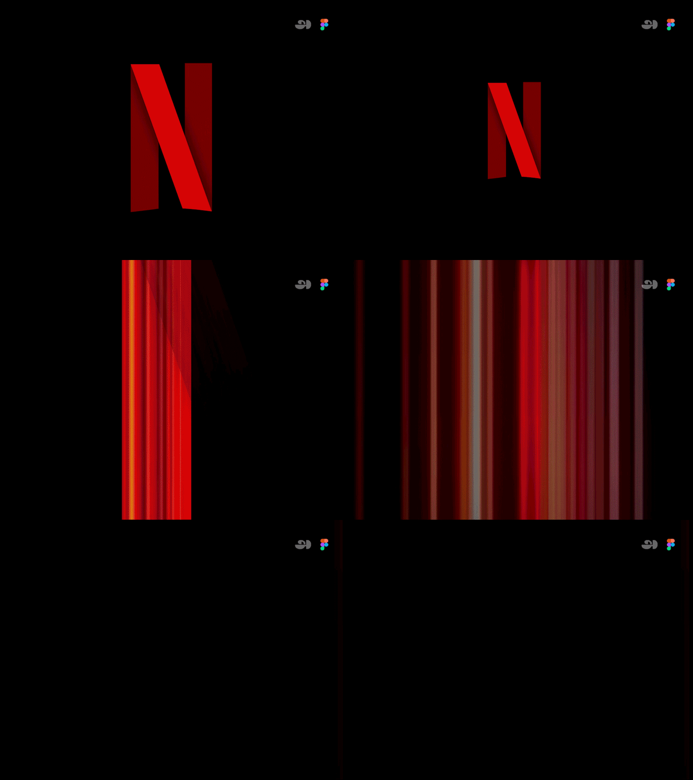
Along with the now-iconic “ta-dum” sound, Netflix’s loading visual is well-known and well-loved. Because the animation doubles as a loading screen, it doesn’t feel intrusive or overdone. It’s reminiscent of classic film grain, and it ensures that the Netflix visual identity is central to the viewer experience, regardless of whether the program is a Netflix original or not.

Animate your logo as part of a brand pattern
For Calling All Optimists, a GMAC brand, we developed an animated brand pattern using elements pulled directly from the brand’s logo. This is a handy asset in any brand’s toolbox, because it’s a custom element that can be used in place of stock imagery or generic graphics, and it can be front-and-center or fade into the background. You can explore our case study for Calling All Optimists here.

Tell a story about your brand using animation
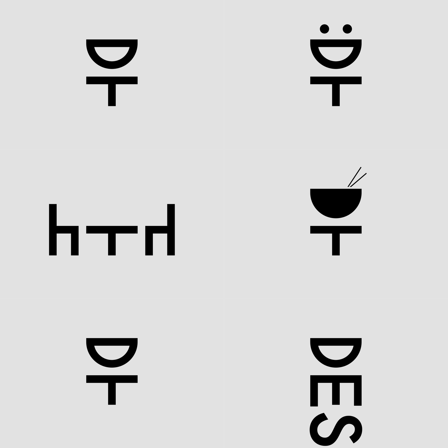
Designtorget is a Swedish design house that sells all kinds of homewares, and their logo animation helps convey their line of business to unfamiliar customers. Using the “D” and “T” figures from their logo, shifting them around with other simple lines to portray things like a table and chairs and an abstract smiling person. This animation demonstrates the brand’s actual offerings while also presenting a playful, modern brand identity.
 Ready to explore how logo motion can boost your brand? Contact Bluetext to learn about our dynamic branding and motion design services.
