We’ve all heard the old adage “the medium is the message” – and that could not be more true in today’s vast media landscape where the majority of users are browsing websites on mobile devices. Knowing that users are visiting your website and often encountering your brand for the first time on a mobile platform, it is essential to thoughtfully design a mobile user experience that takes into consideration both the benefits and limitations of mobile devices as well as known user behaviors.
Mobile web design should not just be a narrowed version of the desktop experience, it should be a responsive design in and of itself that gives way to an intuitive user experience and easy navigation to the information the user is looking for. There are so many variables that can cause a user to leave a website. A slow-loading page or poor content layout can be enough to drive users away – don’t let a lack of forethought when it comes to the mobile user experience be a barrier between your audience and your website. By implementing the following best practices, you will be sure to create the best mobile experience for your users:
Ease of Click is Key
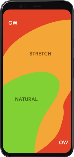
You should always keep in mind what we know about all users visiting your website – every action you ask them to take should be as easy and frictionless as possible. Before even considering the content that will go on a page, you need to consider where on page it will be most accessible. In 2011, Steven Hoober and Eric Berkman published a study called “Designing Mobile Interfaces” in which they coined the term “thumb zone.” This refers to the areas on mobile screens that are most easily reached by the users’ thumbs and therefore where all important clickable items should be placed. Placing important buttons and links in difficult-to-reach areas on screen can add barriers to content and therefore detract from the overall user experience.
Intuitive Navigation
Whether a user knows exactly what they’re looking for or they are purely just browsing on your site, the path to information should always be clear and natural. Creating the best navigation for your site requires thoughtfulness of content and consideration of your audience and the way they are used to maneuvering through a website. The navigation should make sense for the content you have to offer while also aligning with the organizational structure that your users are familiar with. There are many correct ways to layout the navigation of your website, you just need to find one that is the best fit for you and your audience. Employing intuitive navigation on your website is particularly important on mobile platforms because eliminating clicks to content while also having a well-organized site structure can assuage user frustration, encouraging them to stay on your site longer and to visit more pages. Solutions like hamburger menus help organize the menu in a way that the user isn’t overwhelmed by the menu items all at once when first arriving on the page while also mimicking the structure of the desktop site.
Cross-Device Consistency
While the mobile experience of a website should not just be a minified version of the desktop interface, keeping consistent UX design across desktop, tablet and mobile devices should always be a priority when creating your website. Responsive design across the board is crucial when trying to keep the user from disengaging from your site. Any inconsistency that arises when switching from one device to another can create confusion for the user and create the perfect opportunity for them to leave your website. Once again, it always comes back to making everything seamless and easy for your user. The mobile web design should be a full experience in and of itself that considers the intricacies of mobile user behavior while also mirroring the overall UX of the desktop interface. It is a delicate balance but is very worth it when done right.
Prioritization and Breakdown of Content
Simply due to the nature of mobile devices, there simply isn’t much space to fit content in one viewport. This means that in order to encourage your audience to 1) consume the content you write and 2) take away the most important points, you have to visually break up content to make it digestible while also pulling out the highlights as visually engaging elements on the page. Drawing users to your website is a challenge in and of itself – this is only compounded by the challenge of capturing enough of their attention so that they read a significant amount of content while on your site. The reality is you have a very short window to grab their attention and once you have it, concisely driving home the main takeaways is crucial. On mobile, in particular, breaking up content into chunks rather than overwhelming the user with massive blocks of text is a good way to make it all seem more approachable especially when you are trying to fit content into such a small screen. Highlighting specific points using statistics and images in a visually interesting way is a great way to also hold user attention.
Conclusion
Users have shown over a number of years now that the age of mobile device browsing is here to stay and if you choose to ignore it, you will get left behind. When designing for mobile devices, there is so much to be gained by considering what we know about users and the way they physically interact with their devices, and the way they consume content. Mobile web design principles center around the idea that users should always be presented with the path of least resistance when it comes to finding the information they need on your website as well as actually clicking the button to get there.
If your website needs a mobile makeover, contact Bluetext to learn about our website user experience design services.