
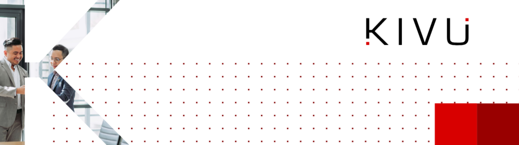
Bold New Brand Identity
After a full discovery process and extensive competitive analysis, Bluetext identified key opportunities for Kivu to stand out with a bold new brand identity. Bluetext brought new life to the Kivu brand while communicating its original and core brand messages to consumers. The squares at the beginning and end of the Kivu logo have a twofold purpose; they provide visual interest and a foundation for other key brand elements and symbolize the expertise and end-to-end cybersecurity solutions Kivu provides to customers.
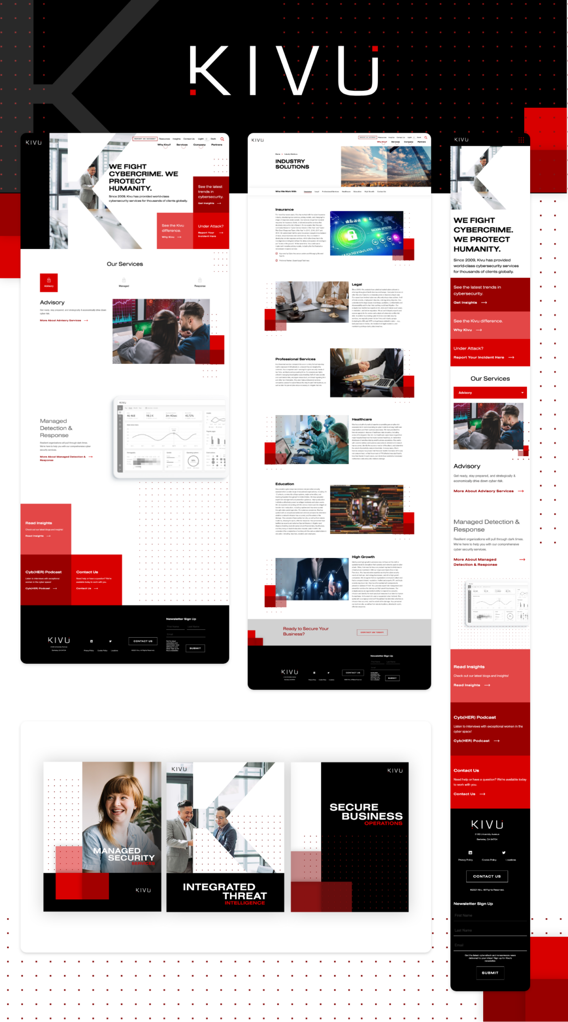
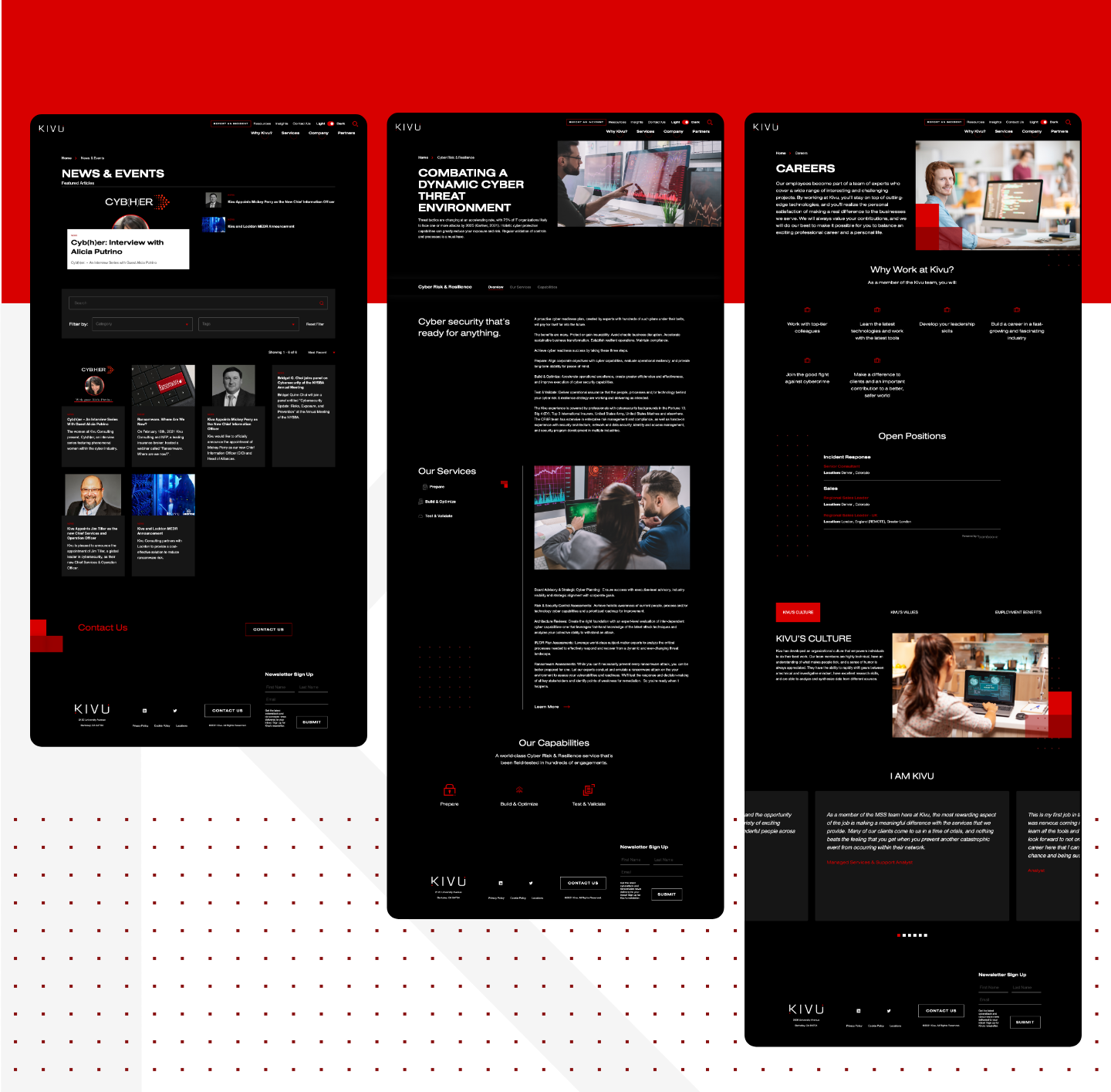
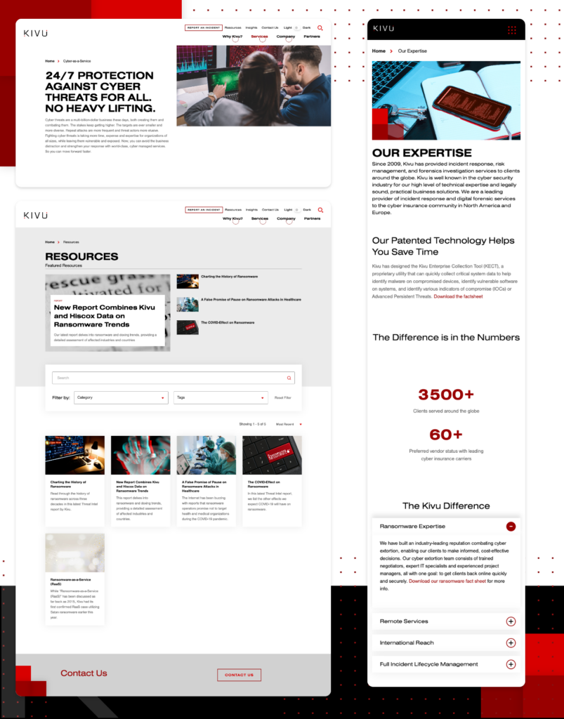
Striking Website Designs
Bluetext translated the sleek new brand identity into a striking new website for Kivu. To stand out from the crowd and portray innovation and leadership, Bluetext designed the website in both dark and light mode, allowing users to toggle between the different interfaces for a truly unique and memorable experience on the site.
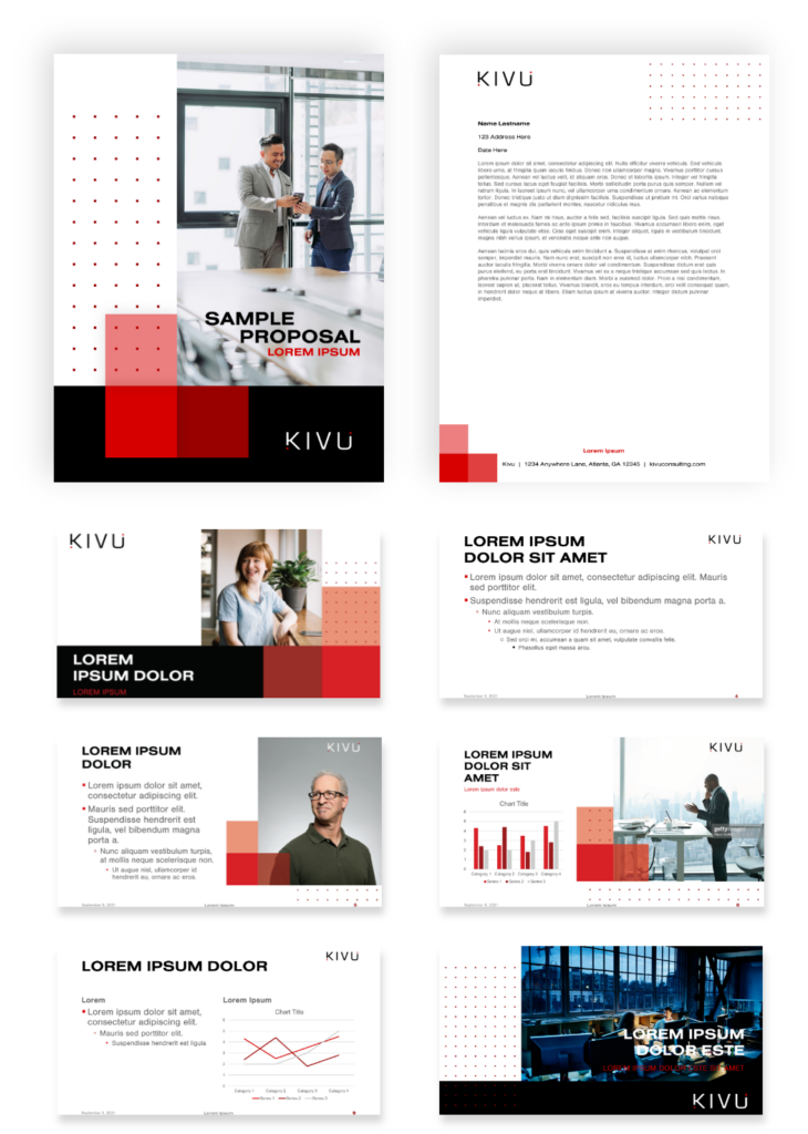
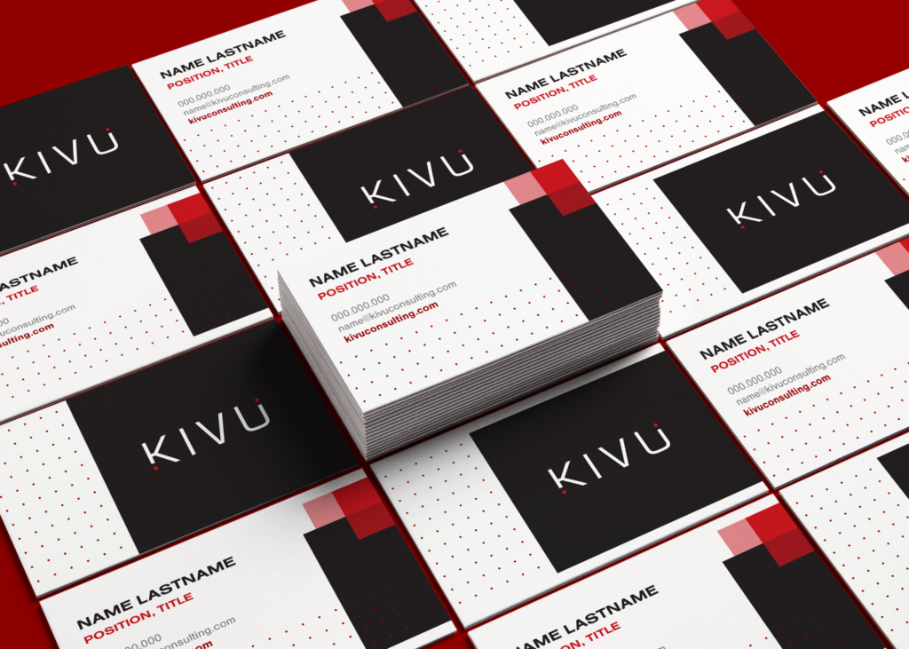
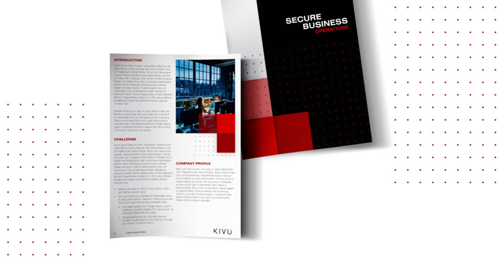
Consistency Through Collateral
Bluetext designed scalable collateral templates that explored different ways of expressing the new Kivu brand identity. Each piece succinctly communicates the core messages while incorporating unique brand elements. From the “K” masking to the square shapes and patterns, each collateral template incorporates critical elements of the Kivu brand system to further enforce brand recognition.