The hamburger, what’s not to love? No, not the American classic, but the navigation menu design. You know, the one with those three straight lines found in the top right corner of your screen. It’s an icon that hides a collapsible menu of possible link destinations, normally appearing on mobile designs. The hamburger menu is actually quite controversial in the UX design community. As such, Bluetext decided to break it down to deconstruct the user experience pros and cons of the hamburger menu.
Where does this funky food inspired design come from? The icon is actually a remnant of the 1980s, making it the perfect choice for retro embracing brands. The hamburger menu first debuted on Xerox copy machines, which had limited space and were therefore designed to be as simple as possible. The icon itself looked a lot like the menu that appeared when you clicked on it.
The design fell off designers’ radars for a few decades until a sudden resurgence in the mid-2000s. Why so? The emergence of mobile browsing had UX design teams more challenged to fit information on screens smaller than ever before. Facebook was one of the early adopters of the retro style and the design trend quickly caught on with many other websites and applications. 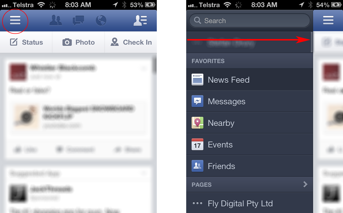
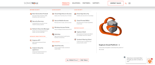
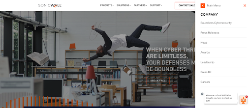
Larger websites have even adopted a hybrid approach, which uses both traditional top navigation and the hamburger even on desktops. Take the Bluetext client, SonicWall, for example. With a large number of products, solutions, and support resources to showcase, they needed a mega menu to encompass all links in an organized and interesting fashion. The top menu drops down to display page titles, short descriptions and even iconography for the high traffic areas of the website. To avoid overcrowding, other sections of the website are moved to a hamburger side menu for a cleaner user experience.
Some UX designers (vegans if you will) hate the hamburger menu. The main complaint with the design is that users can’t go anywhere or see anything without clicking the menu open. Many users expect immediate and obvious information, as seen in traditional top navigation designs. Many UX designers believe an intuitive navigation should obviously show two things: where a user currently is, and where they can go.
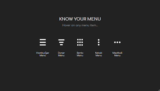
The hamburger menu has been the UX design go-to for years, but many companies are starting to debut some new menu items. For example the three dot approach often dubbed “the kebab”.
With mobile and tablet devices growing in popularity, there’s no doubt menu designs will continue to evolve in the future.
Does your website menu need a refresh? Contact Bluetext today to learn about our web and UX design services.