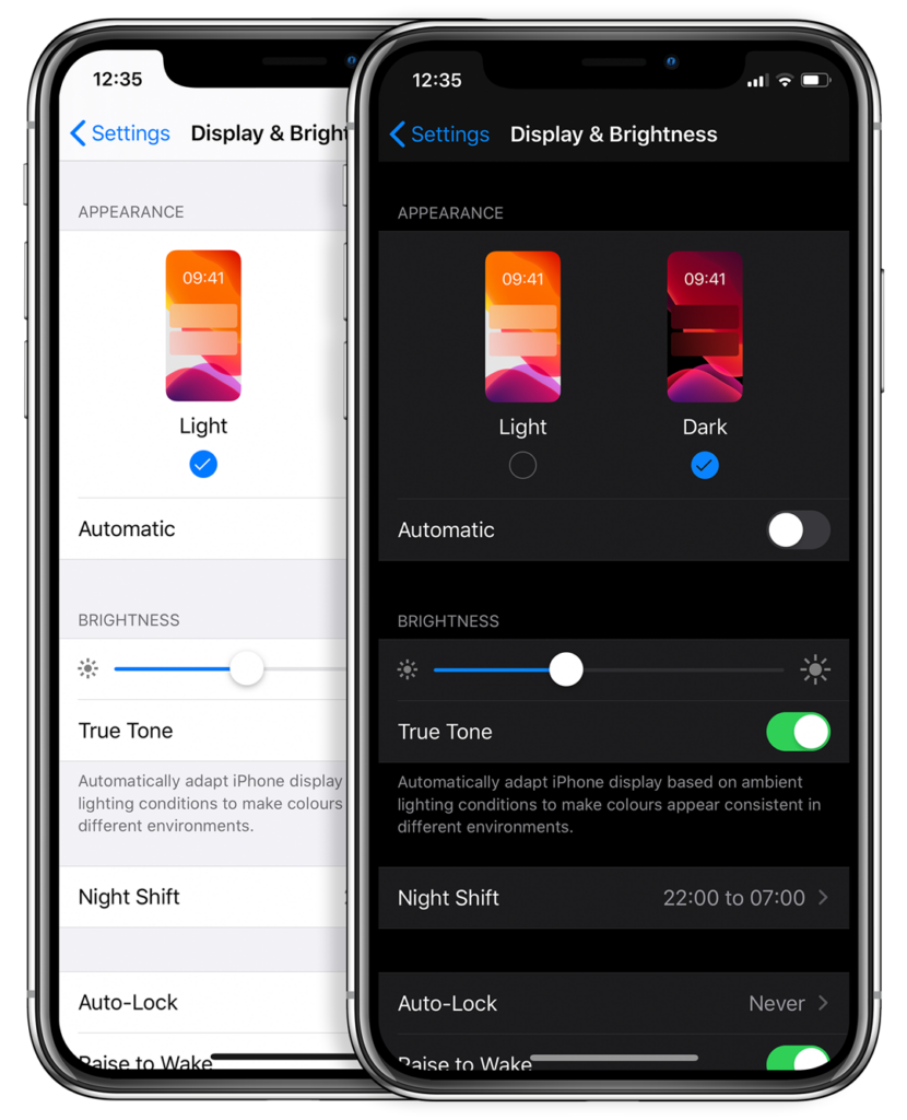
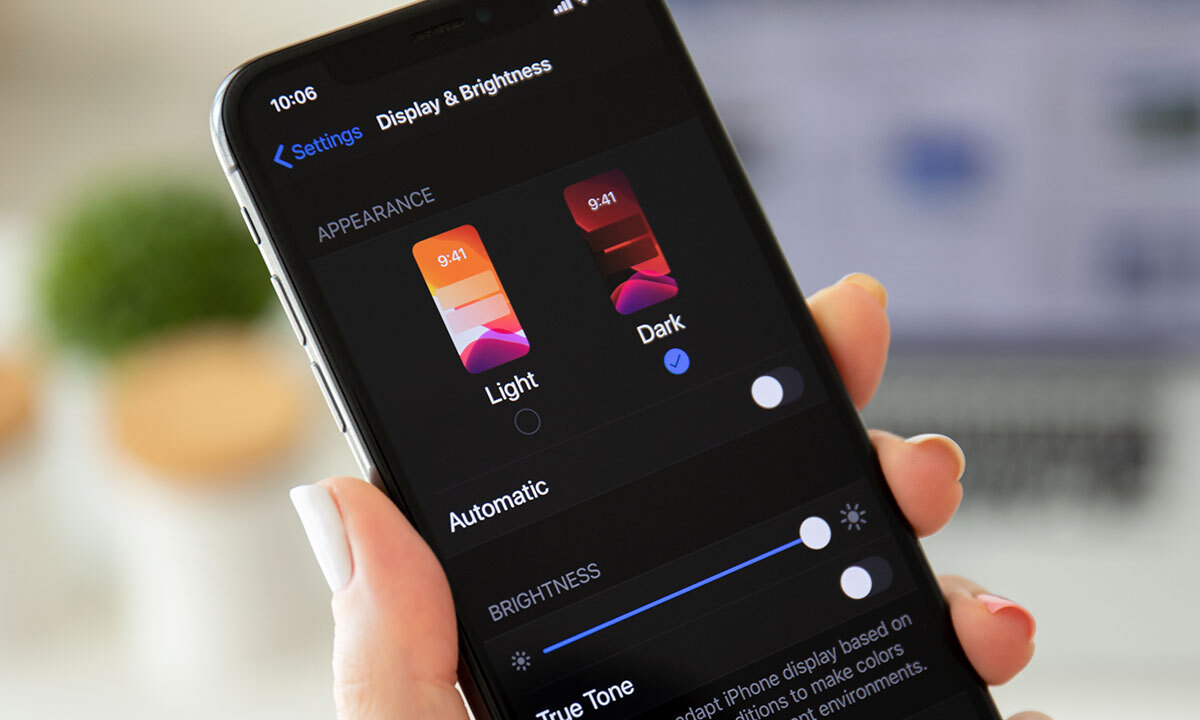
Could the dark mode interface eclipse their light mode counterparts? Dark mode has seen a continued rise in popularity over the past few years following the 2019 release of Apple’s dark mode option alongside the iOS 13 update. Sometimes referred to as “Night Mode”, “Shadow Mode” or “Dark View”, this dark mode is a design term used to describe a low-light user interface that uses a dark color as the primary background color, reversing the default light-on-dark design that designers have used for decades.
In response to increased user screen time across devices, this darker UI design trend has garnered immense popularity. Big-name brands like Facebook, Google, WhatsApp, Instagram, and Apple were all early movers in adopting dark mode interfaces and have influenced many others to follow in their footsteps. That being said, operating systems, browsers, and apps are not the only places dark mode is continuing to grow in its popularity — more and more website developers and designers are hopping on the dark mode train, opting for UX/UI designs that are dark as night with reasons why that are clear as day.
A “Site” for Sore Eyes, in More Ways Than One
It’s no secret that the aesthetics of a dark mode design can elicit powerful feelings and emotions from visitors. A dark color theme often conveys sophistication, edge, and modern elegance to users. Black is an especially dominant color, often used to create maximum color contrast when paired with whites or vibrant tones. Dark hues are often associated with style and power, which can add striking visual appeal and depth when used strategically as a website’s background. Dark mode is especially useful for image and video-heavy sites. The dark contrasts bright colors, making them look more compelling and instantly captures the audience’s attention. The more visually appealing users find your site, the more likely they are to engage with your content and remain on-page.
More than a Pretty (Inter)face
Aside from just looking easy on the eyes, dark mode can actually be easier on the eyes. Some studies show that dark mode can help reduce the sensation of discomfort that is sometimes felt by staring at websites with light backgrounds. It is especially preferable in low-light conditions where looking at bright white screens for long periods of time on any device can result in eye strain and fatigue. Reducing the pain associated with light-on-dark interfaces by switching to a dark-on-light display can help encourage users to stay on your site for longer.
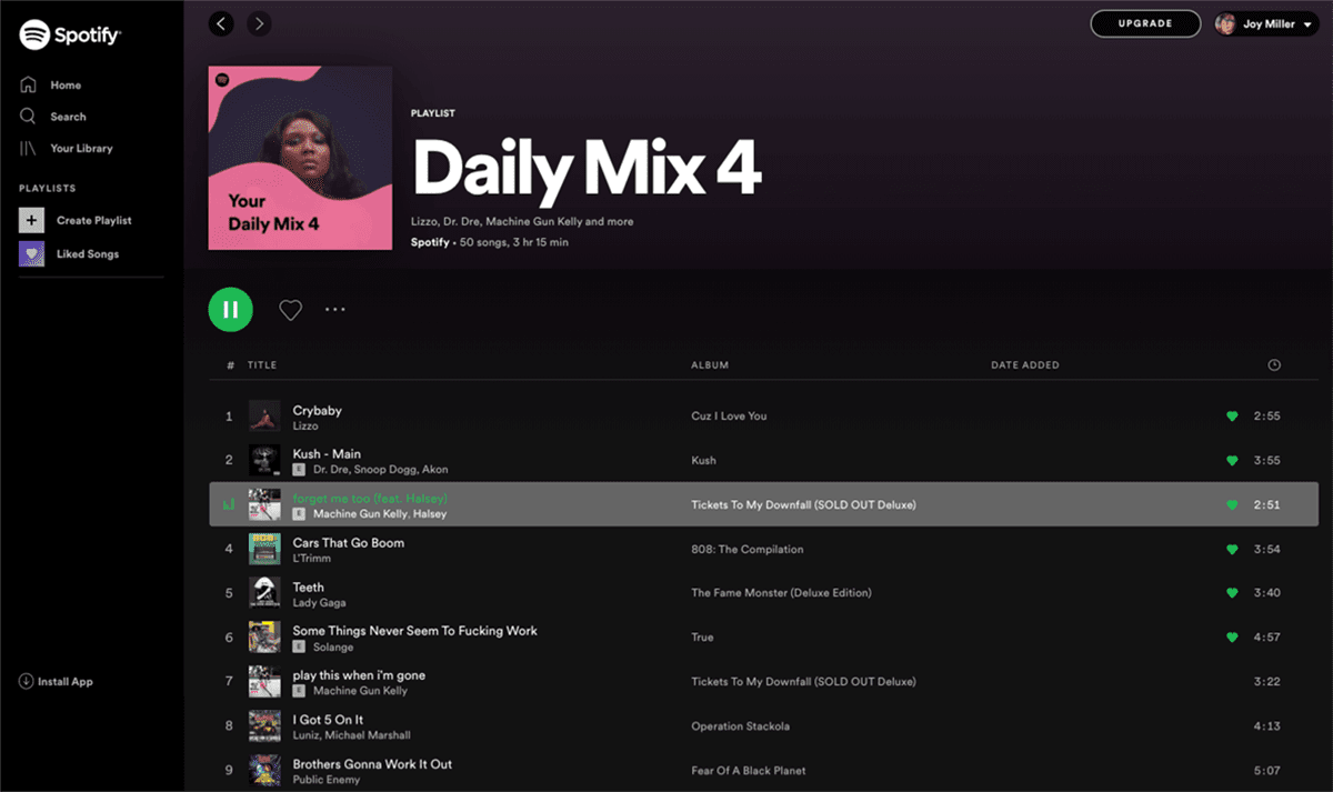
If you’re a Spotify user, your eyes (and ears) have been benefiting from dark mode features for years.
Dark Mode Can Save Brain and Battery Power
UX research shows that dark backgrounds enhance page contrast, making visuals pop and easier for the users to focus on. If your site is imagery-heavy or puts an emphasis on visual or graphic content, dark mode will allow users to be more engaged and get through your site quicker and easier, retaining more content faster and leaving with a stronger impression of what you have to offer.
Dark mode can also save device battery life. Studies show a dark theme can reduce battery usage significantly, especially for users viewing your site on a mobile device. White pixels are more power-hungry than dark pixels, which allow devices to use less energy. In an era when users are glued to their screens, anything that can save device battery power is a win — and your website could be one of those things.
So Now You’re Interested in Dark Mode, but Don’t Know Where to Start?
Good thing Bluetext has got you covered. As a leading digital marketing agency in DC that specializes in website design and making powerful sites for clients all over the world, we’d like to offer up a few pieces of advice to consider when thinking about creating or adding dark mode to your site:
- Determine if dark mode is really right for your website content–and where. Dark mode is great for enhancing emotional branding, showcasing photos and graphics, and emphasizing visual content, but not so great for displaying big chunks of text. Light text on dark backgrounds can cause readability issues in practice, so portions of your website that are or will be pretty text-heavy, dark mode may not be the best choice to display your content. Consider reserving dark mode for a homepage, or flashy campaign landing page, but maybe not your product details.
- Make sure your brand colors can actually work well with a light-on-dark design (see tip #3). If not, but you’re still set on pursuing dark mode, consider going through a rebrand before implementing dark mode.
- Verify your light-on-dark color scheme meets accessibility color contrast standards.
- Dark backgrounds de-accentuate empty space, so limit the number of elements (lots of icons, buttons, and small images) used together within viewports to avoid looking cluttered.
- Make sure your design will work in both low-light and high-light environments.
- Use illumination over shadows to communicate depth.
- Avoid highly saturated colors.
- Leave room for a regular/light option and give users the ability to toggle back and forth as they desire.
- Work with an agency like Bluetext to ensure your dark mode website is sleek, powerful, on-brand, and communicates a strong and engaging message to your audience.
Learn more about dark mode and how Bluetext can help you take your website to the next level. Contact us today.
Recent Posts
Bluetext’s Recent Work