

Launching the New Brand
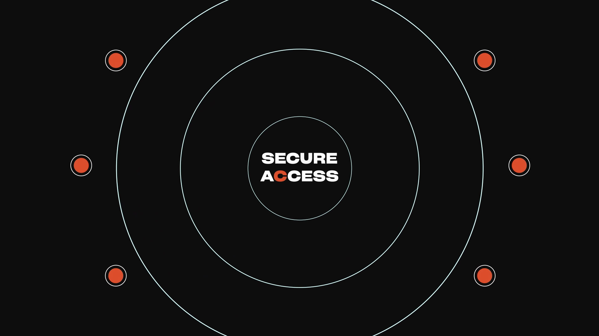
Appgate focuses on making access simpler for users and harder for adversaries. Hence, they needed a sleek, modern, but also simple brand identity to communicate this value. Their new logo emphasized the circular nature of their lowercase wordmark, to symbolize a closed circuit of cyber protection. To showcase their cutting-edge technology and offensive background, angled slants accent the rounded lettering.
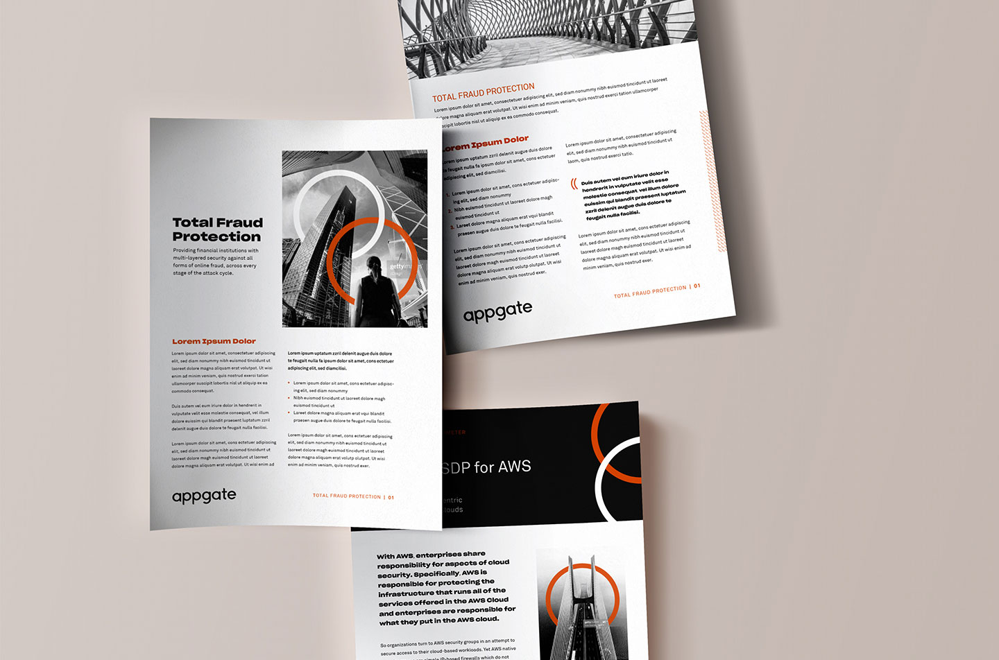
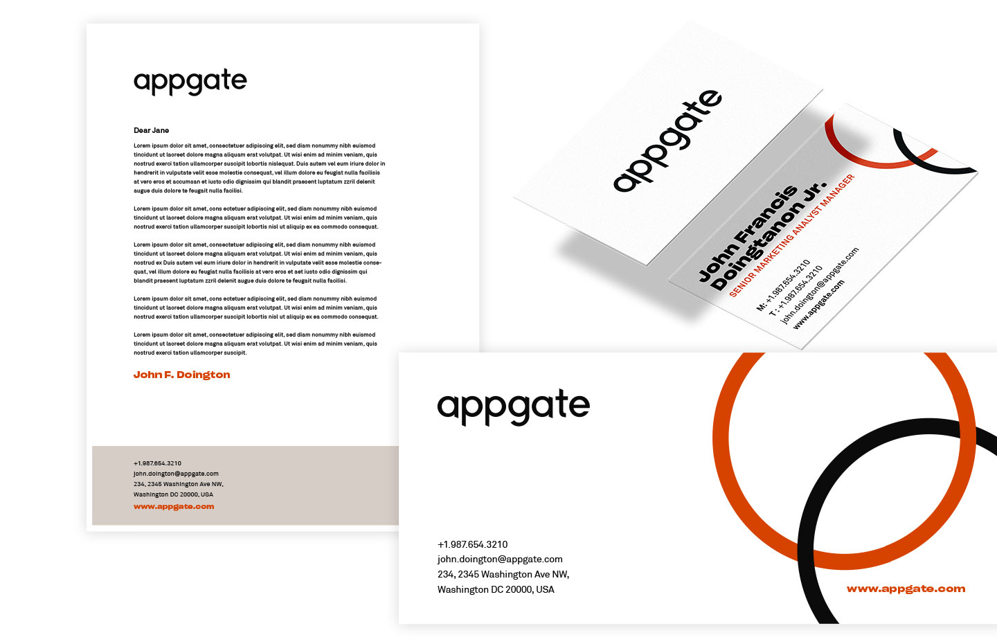
Being an intangible solutions provider, Appgate chose to rely on strong messaging and brand symbolism as opposed to abstract imagery.

Expressive Brand Motion
To promote the launch of the new brand, Bluetext produced a 30-second ad, complete with animated expressions of the brand, to educate prospects on the capabilities of the products Appgate offers.
Digital Brand Applications
The website displayed a library of key art, which imposed interconnected rings atop modern architecture. Wordlocked grids were used in place of imagery to reinforce key proof points. With a new responsive website, they could now send users to the website for product information with confidence in multi-platform compatibility.
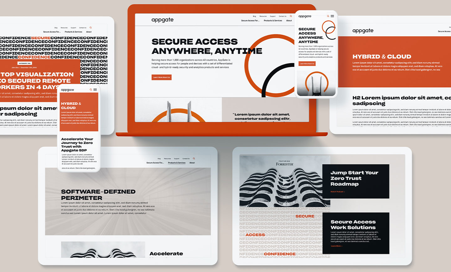
Appgate was able to communicate its full product & services line with a persona-based navigation strategy that created a cohesive journey throughout their product lines.