It’s no secret that mobile internet use has seen significant growth in the past few years. Over half of all web traffic now comes from mobile users, a majority of which are those using their smartphones to surf the internet.
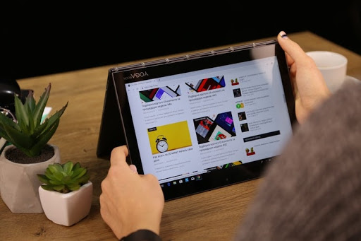
However, with an installed base of over 190 million devices in the United States and counting, there’s a high likelihood that some of the mobile users visiting your site are doing so from a tablet device as well. It’s just as crucial for your website to look good and function properly on these devices as it is on laptops and smartphones, because in order to be relevant on the web today, your site must perform on all the devices that use the web.
Thinking beyond the desktop
Unfortunately, standard desktop sites don’t have the best track record for working seamlessly on tablets on default. Even websites designed to be responsive in the transition from desktop to mobile face complications on unique tablet sizes. Oftentimes, a site may register a tablet as a mobile device, causing the font and buttons to be too small and intended for a small phone screen. On the contrary, if a site still displays the desktop version, the content becomes too close together, and many of the interactive functionalities just don’t work. While desktop sites are a great starting point, intentional design tweaks are needed to make your website tablet-friendly. Because, no matter what device your visitors are using, the goal is to give them all the best possible user experience on your site.
Luckily as a top website design agency, Bluetext has picked up several techniques over the years that make your user experience goals possible. Whether you’re starting to build a new effective tablet site or are looking to improve your current tablet user experience, here are 5 tips for tablet-friendly website design.
-
Increase font size, line height, and margins for legibility
Let’s be honest, we all know how annoying it is to have to consistently double tap or pinch your screen in order to read the content on a page. Avoid making tablet users do this on your site by bumping the font size up a few pixels, or to at least 16px, and use a line height of 1.5 for some extra breathing room between lines on text-heavy pages. To improve legibility even more, try increasing margins on pages and content blocks to add white space and reduce overall visual complexity, so your website’s content is easier for users to read and consume.
-
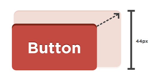
Improve finger-friendliness
Unfortunately, human fingers tend to be much less deliberate and a whole lot clumsier than the tiny point of a computer cursor. This means that anything you want a user to click on a tablet, whether that be buttons, menu items, or form fields, needs to be appropriately spaced and sized to allow room for our fingertips. Based on the average width of the index finger for most adults, a touch target of at least 44 pixels should allow a user’s finger to fit comfortably within the target. Additionally, increasing padding around touch targets by 5-10 pixels will improve user accuracy and reduce the frustration that often comes with unintended button-clicking and navigation.
-
…and make touch targets obvious
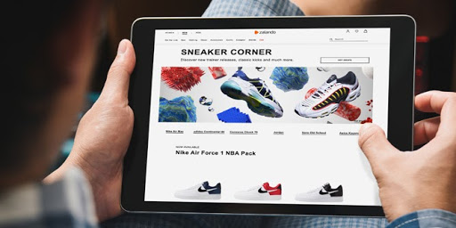
Not only should there be ample room to click on touch targets, but it should be very clear where and what those touch targets are. All buttons, CTAs, clickable links or elements should be large, bold, and stand out from the rest of their surrounding content. Hover states do not exist on a tablet, so styling with contrasting colors, underlines or shadows helps these touch targets to look tap-able. The more obvious CTAs are to your visitors, the more they’ll be able to navigate intentionally and with confidence.
-
Make people tap-happy
You don’t want to just design a website that’s easy to use, but one that’s pleasant and satisfying to explore! Keep in mind that a lot of your tablet visitors use that same device for personal entertainment and are used to clicking, swiping, sliding, and pinching their way through various apps. Creating visually enticing opportunities for tablet users to tap and engage with your site via unique interactive components like sliders, carousels, or accordions could not only help increase the amount of time they spend on your site, but make it more enjoyable.

-
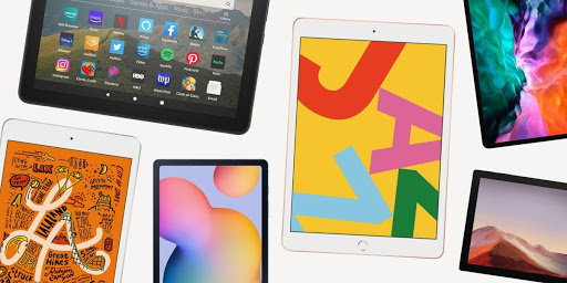
Design & test on the most appropriate tablets
Lastly, it’s important to keep in mind where most of your visitors are coming from when designing and testing your tablet sites. There are dozens of different tablet makes and models out there today, with screen sizes anywhere from 7 to 12 inches wide. Unfortunately, it isn’t possible to test your website on every single one. This is where your website’s analytics come in handy; using tools like Google Analytics can help you determine which devices and browsers are most frequently accessing your website, so you can narrow your efforts on the tablets that make up a majority of your traffic and optimize for the greatest number of users.
Taking these steps and making these small changes can make a huge difference in the experience tablet users have on your website. Making it easy for them to read, navigate, click, and enjoy finding content or information on your site from all of their devices is crucial to keep visitors engaged and coming back for more.
Interested in tablet-proofing your website? Get in touch with Bluetext to see what our top visual designers can do for you.